THE FULL SKILL
This is the text the agent reads before it designs.
Essence
Named after architectural beton brut (raw concrete) and gathered by Pascal Deville on brutalistwebsites.com from about 2014. A reaction to templated, friendly, polished web design: show the medium (links, tables, default type) instead of hiding it. Craigslist, Hacker News and handwritten HTML sites are the ancestors; art, fashion, indie publishing and portfolios are the users today. Differs from neo-brutalism: no cute color, no shadows. The aim is honesty, speed and attitude; it is not an excuse for unusable pages.
Visual vocabulary
- Layout: left-aligned single column or rigid 2-3 column tables; content starts at the top-left with no hero polish. A numbered index or sitemap is displayed as content.
- Type: system and mono feel. Courier Prime, Space Mono, IBM Plex Mono for mono; Arimo (Arial-metric) or Tinos (Times-metric) as the web-safe stand-ins. One size for body (16-18), headlines large (64-120) and tightly set, uppercase allowed.
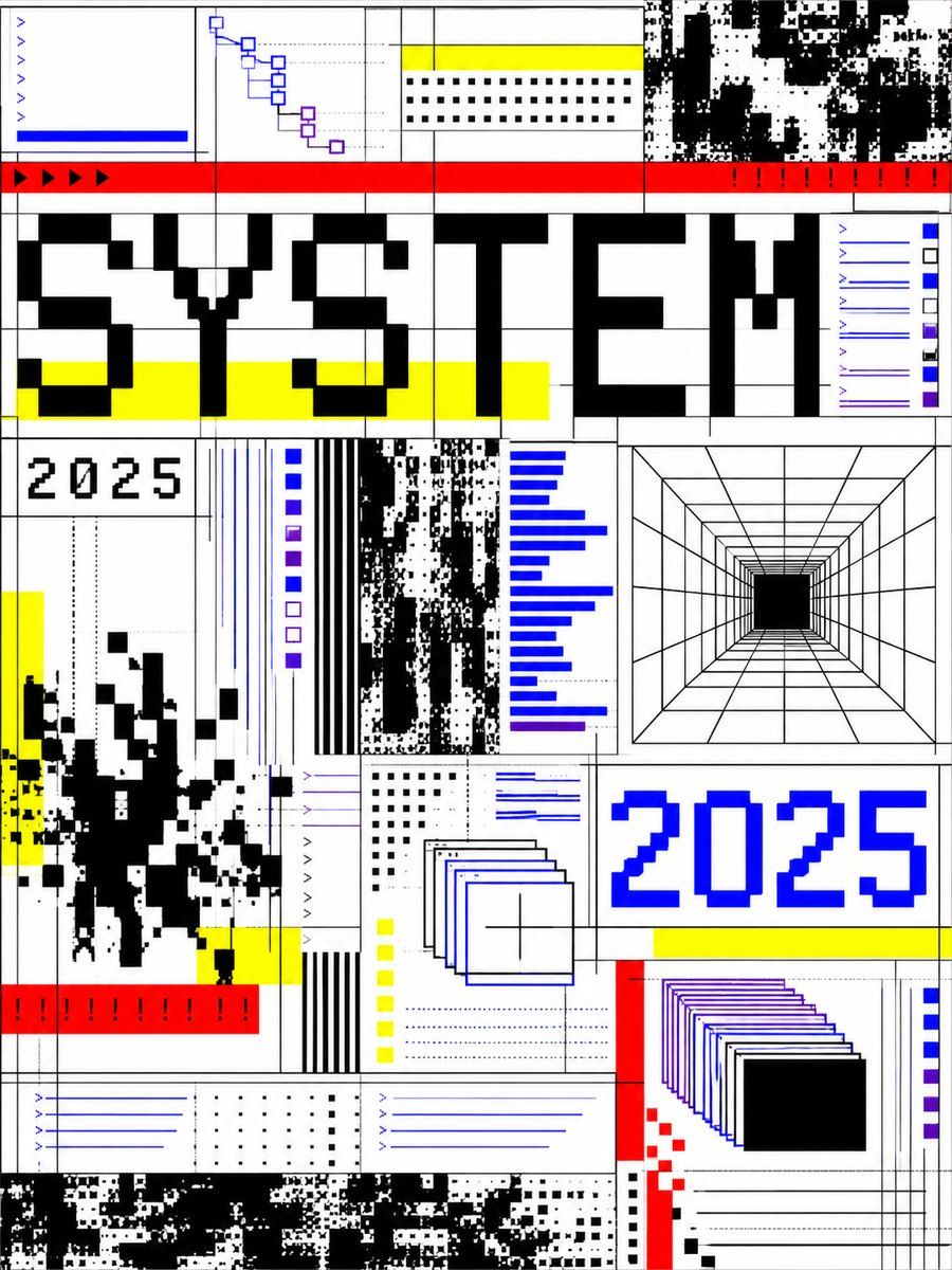
- Color: #FFFFFF paper, #000000 ink, link #0000EE, visited #551A8B, highlight #FFFF00, alert #FF0000, optional terminal #00FF00 on black. Raw web-safe colors are the point.
- Structure: 1px or 2px black rules between sections, boxed tables, bracketed buttons like [ Submit ], underlined links.
- Shape: radius 0, no shadows, no gradients, no animation.
- Icons: avoid, or lucide stroke 2 in plain ink; text labels beat icons.
Translating into Pego
- Variables: $paper #FFFFFF, $ink #000000, $link #0000EE, $mark #FFFF00, $rule 1, $gap 16, $radius 0.
- Landing page: root frame $paper, padding [32, 32]; top row with the site name in 16 mono left and an inline link list (text nodes, underlined by color #0000EE; label in brackets); an oversized headline 96 / weight 700 / lineHeight 1.0 spanning the width in Arimo or Space Mono; a 2px rule; a two-column table (frames with 1px stroke) listing features as rows (label | detail); a plain bracketed button [ Download ] in a 2px stroke frame.
- App screen: a bordered table as the main object, headers uppercase 12 mono, rows 40 tall with 1px separators, actions as bracketed text.
- Components: Link, Table Row, Boxed Button (stroke 2, padding [8, 16], no fill; hover variant $mark fill).
Pitfalls
- Raw does not mean illegible: broken contrast, tiny type and hidden navigation are failures, not style. Nielsen-style usability still applies.
- Random overlaps and off-grid blocks should be rare and deliberate, with text never covered.
- Do not decorate it with gradients, glow or rounded cards; those turn it into slop.
- Avoid for conversion-critical consumer flows, healthcare and banking unless the brand demands it.
- Do not fake a "retro OS" window chrome; that is a different style.
Pair with
portfolio, landing-page and docs build skills.
Fonts: Courier Prime, Space Mono, Arimo, Tinos