THE FULL SKILL
This is the text the agent reads before it designs.
Essence
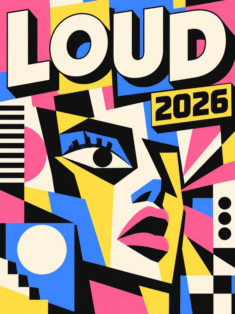
A mash-up of brutalist web rawness with friendly, poppy color. Roots: the 2014 brutalist web movement, then startups and creator tools (Gumroad's 2021 look is the usual reference) around 2021-2023. The idea: say "we are a human company, not a corporation" with exaggerated, obvious UI: thick outlines, hard shadows, zero polish. It solves sameness in SaaS visuals and gives instant recognizability. It is also now a template look, so execution has to be intentional.
Visual vocabulary
- Ground: cream #FFF8E7 or off-white #FAF7F0 page; panels white or color blocks.
- Ink: near-black #111111 for all strokes, shadows and text.
- Accents (flat, saturated): yellow #FFD93D, pink #FF6B9D, blue #4D96FF, mint #6BCB77, orange #FF8E3C, lilac #C8A2FF. Use 2-3 per design.
- Stroke 2 on controls, 3 on large cards. Radius 0 for a sharper feel, or 8 consistently.
- Shadow: solid ink, no blur, offset 4 (controls) to 8 (cards), always the same direction.
- Type: Space Grotesk, Archivo, Syne or DM Sans in 700-800 for headings, same family 400-500 for body; Space Mono for labels and prices. Headline 56-88.
- Rotation: tiny tilts (-2 to 2 degrees) on stickers and badges only; layout stays square.
- Icons: lucide stroke 2.5-3 in ink.
Translating into Pego
- Variables: $page #FFF8E7, $ink #111111, $surface #FFFFFF, $accent-1 #FFD93D, $accent-2 #FF6B9D, $accent-3 #4D96FF, $stroke 2, $stroke-lg 3, $shadow-offset 6, $radius 8.
- Hard shadow recipe: a group of two rectangles. Back rectangle: fill $ink, same width, height and radius, positioned x +6, y +6. Front: fill color, stroke $ink 2. Wrap both in a layout none frame sized width+6 by height+6 so layout flow stays correct; for components, put it inside the component so instances inherit it.
- Components: Button (height 52, padding [0, 24], label 16 weight 700, front $accent-1 over shadow), Card (padding 24, stroke 2, shadow 8), Input (white, stroke 2, shadow 4), Tag (radius full, stroke 2, rotation -2 optional).
- Landing hero: $page, nav row with a bordered button; headline 80 weight 800 with one word on an $accent-1 highlight block; support 20; button pair; right side a tilted sticker card (rotation 3) containing a product stat; below, a marquee-style band in $accent-2 with 2px stroke top and bottom.
- App screen: sidebar white with 2px right stroke, content cards in color blocks with shadows, KPI numbers in 48 mono.
Pitfalls
- Everything shadowed is noise: shadow only the interactive and the key card. Mixed shadow sizes or stroke widths look sloppy, not brutal.
- Low contrast pastel text on color blocks; use ink text.
- Wide strokes and shadows eat small screens: at 390 reduce offset to 4 and stroke to 2.
- Overused, so avoid for finance, health, legal or luxury unless intentionally playful.
Pair with
landing-page, pricing and portfolio build skills.
Fonts: Space Grotesk, Archivo, Space Mono