THE FULL SKILL
This is the text the agent reads before it designs.
Essence
After Emigre and Cranbrook showed that the Mac could break rules, David Carson (art director of Beach Culture, then Ray Gun from 1992) used page and type as emotion: overlapping, cropped, rotated, torn, sometimes set in a dingbat face when he found an interview dull. The Ray Gun critics called it unreadable; Carson's counter was that an unreadable page still communicates. Neville Brody, who art-directed The Face (1981-86) and Arena (1987-90) with hand-built sans faces, called it "the end of print" in a joint interview, and Carson took it as the title of his 1995 monograph. The look rhymes with Seattle music, zines and photocopiers: do-it-yourself, anti-polish, anti-corporate. It is a reaction against the clean, corporate 80s page. Treat it as a voice for a scene, not a universal skin.
Visual vocabulary
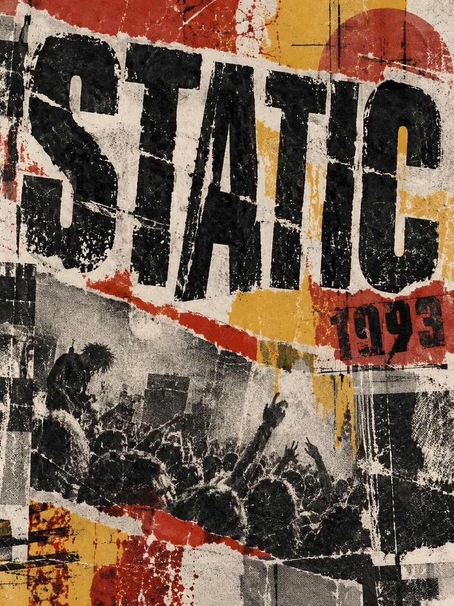
- Composition: full-bleed, off-balance, text pushed to the edges, a few huge crops, cut by thick rules, text columns dropped in at odd places, a single narrow column of readable copy.
Fonts: Anton, League Gothic, Special Elite, Courier Prime, Rubik Distressed, Permanent Marker, Barlow Condensed, Inter
- Typography: Display Anton or League Gothic 120-260, tight lineHeight 0.85, uppercase, sometimes stretched by making one line much larger; typewriter (Special Elite) at 14-18 for notes; Permanent Marker at 28-48 for a scribbled annotation; Rubik Distressed only for one word. Body: Inter or Barlow Condensed 400, 16-18.
- Color (variables): gPaper #E9E4D8 (45 percent), gInk #0D0D0D (30 percent), gRust #B5472F, gMustard #D9A62E, gGrey #77756F, gBlood #8E1B1B (accent). Some inverted pages: gInk ground with gPaper type.
- Shapes and texture: thick rectangular bars (tape strips #D9D4C3CC rotated 3-8), scratch lines (thin paths), halftone dots, black registration crosses, misaligned colour blocks (a duplicate rectangle offset 6px), photocopy dust as 60-100 tiny ellipses at 15-30 percent alpha. No drop shadows or gradients.
Pego recipes
- Landing hero (1440 x 800): layout none, fill $gPaper. Headline in Anton 220 uppercase, one word overlaps a $gInk block at 20 percent offset, one line rotated -4. Support copy in a clean vertical frame, 18 Inter, width 480, plain surface; button a black rectangle with typewriter label. Specks and tape as separate low-alpha layers locked in a group named texture.
- Poster / social post (1080 x 1350): photo or a big black rectangle cropped to the edge, title stacked three lines, left aligned, with a rotated Permanent Marker word 24 percent smaller, a typewriter info block bottom right, tape pieces at corners.
- Event page: top band in $gInk with giant date; below, a one-column lineup in Special Elite with thick rules, a ticket CTA bar. Component: lineup-row, tape-label. Texture group stays only in header and footer.
Pitfalls
- "Distressed filter" on everything: the whole page looking dirty reads as a Photoshop preset. Reserve roughness for display type and the graphic edges.
- Ray Gun looked chaotic but was edited: decide the single idea (one image, one headline, one oddity) first.
- Unreadable body copy, white text on dirty photo, low-contrast grey on grey. Never rotate paragraphs or set them in a distressed font.
- Neon green or purple on black is not grunge: grunge is paper, ink, rust and flannel tones.
- Information hidden by style: dates, prices and CTA must stay readable. Accessibility: honor 4.5:1, avoid text below 14px, keep logical order for screen readers.
Pair with
newsprint or high-contrast-mono tokens, the social-media and landing-page skills. Combine with postmodern-new-wave only when you need more structure under the mess.