THE FULL SKILL
This is the text the agent reads before it designs.
Essence
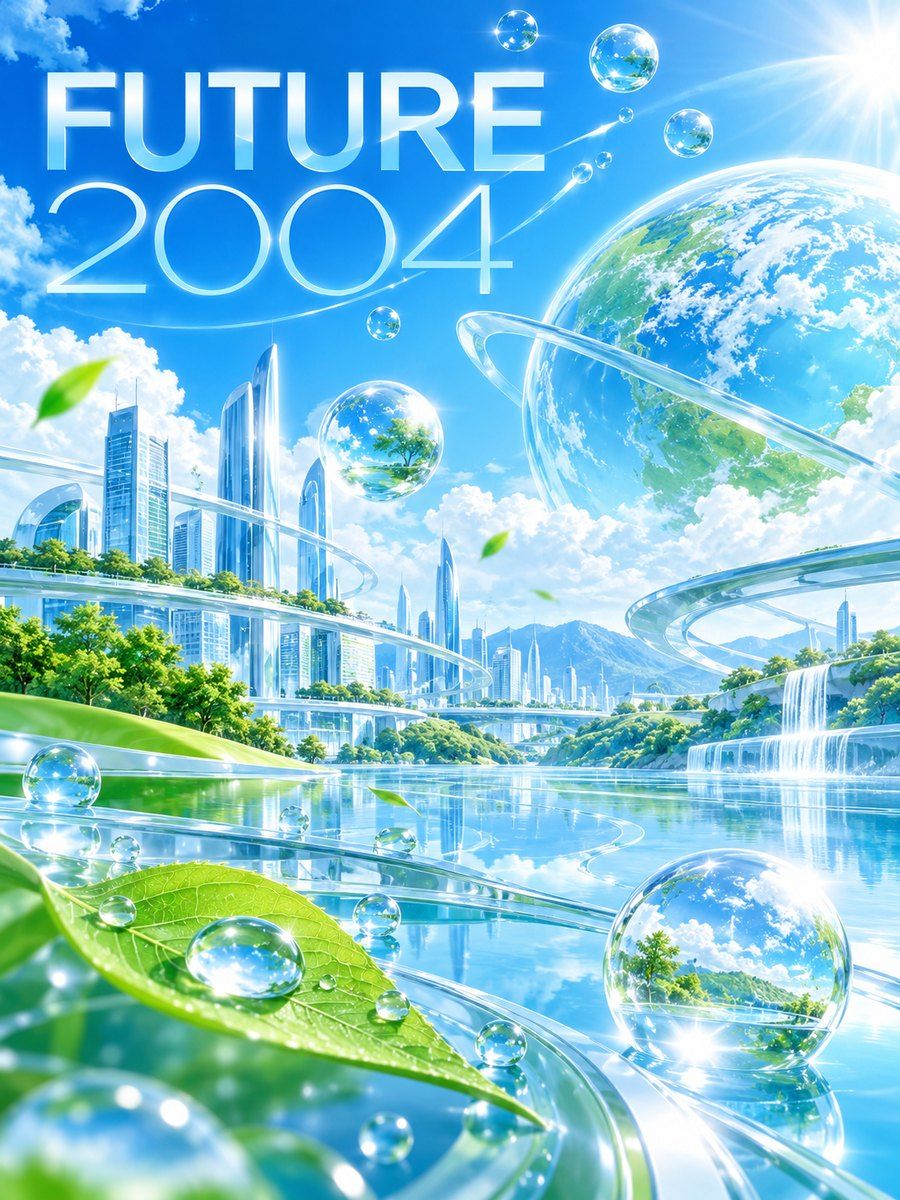
Two related waves of consumer tech optimism. Y2K (about 1998-2004): chrome, translucent plastics, silver, bright blue and candy colors, futuristic sans such as Eurostile-like display faces, as in the first iMacs and early web portals. Frutiger Aero (about 2004-2013; the name coined in 2017 by Sofi Lee and combining Adrian Frutiger's humanist typefaces with Windows Aero): glass, gloss, water, bubbles, sky, fish, leaves, lens flare, and rounded skeuomorphic UI, shaped by Mac OS X Aqua (2001), Windows XP Bliss, Vista (2007) and Web 2.0. It carried a belief that technology and nature would live together in a clean, friendly future, and it ended with flat design around 2013. The revival today is nostalgic; it should feel fresh and warm, not a museum copy.
Visual vocabulary
- Composition: a central luminous object or tile on a clear sky field, soft horizons, big rounded containers, a glossy button as the unmistakable CTA. Light comes from the top.
Fonts: Open Sans, Nunito Sans, Orbitron, Quicksand, Varela Round
- Typography: friendly humanist sans for almost everything, with a techno display for Y2K accents. Headline Nunito Sans 800 or Quicksand 700 at 56-84, body Open Sans 400-500 at 16-18, labels Open Sans 600. Orbitron only for a number or a brand word at 24-40 (Y2K flavor).
- Color (variables): aeroSky #8FD3FF (35 percent), aeroAqua #19C6D8 (15 percent), aeroLeaf #55C241 (10 percent), aeroDeep #0B5FA5 (text and anchors), aeroWhite #FFFFFF (30 percent), aeroMist #EAF7FF (surfaces), aeroSun #FFC53D (accent under 5 percent), aeroInk #0F2B46 (body text). Y2K variant: replace leaf with silver #C9D3DC and a candy pink #FF7AC8 accent.
- Shapes: ellipses and circles for orbs and bubbles; pill buttons (cornerRadius 999); rounded panels (20-28). Build gloss as: base fill, upper highlight ellipse in #FFFFFF55 covering the top 45 percent, bottom reflection #FFFFFF33 crescent, 1px white rim stroke at alpha. Bubbles are rings: a circle with a thin #FFFFFF99 stroke and a small white highlight dot. Leaf shapes with paths.
- Texture substitute: subtle layered horizontal bands of lighter sky for a gradient look (4-6 rectangles at low alpha); sparkles as small four-point paths used sparingly.
Pego recipes
- Landing hero (1440 x 820): fill $aeroSky with 4 lighter bands sliding down to $aeroMist. A large orb cluster of 3-5 ellipses (some with highlights) on the right; on the left a text stack, headline 72 Nunito Sans 800 in $aeroInk, supporting line 20, glossy pill button ($aeroLeaf base with white highlight ellipse, white label 18/700), plus a text link. A floating glass card (fill #FFFFFFCC, white stroke, radius 24) shows a UI snippet.
- Poster / social post (1080 x 1350): sky field top, horizon of lighter bands, a big glossy object centered, headline below at 96 on a solid white glass panel, date in an aqua pill. Keep two focal points at most.
- Event page: header with orb motif, sessions as glass cards of equal height with an aqua number badge, a bright CTA pill pinned at the end of each card. Components: glass-card, gloss-button, bubble-badge.
Pitfalls
- Blur-and-glow on everything (the modern "glassmorphism" slop): gloss belongs to a few key objects; most surfaces are flat and white.
- Text on translucent panel over a busy sky: use opaque enough fills and dark text.
- Clip art overload (dolphins, bubbles, lens flares all at once). Choose a single motif.
- Mixing eras: chrome-silver Y2K and Aero gloss with neon purple gradients end up pastiche. Pick one.
- Accessibility: pale blue on white fails contrast; use aeroDeep or aeroInk for text and keep 44px controls.
Pair with
sunlit-pastel or clinical-light tokens and the landing-page, mobile-app and marketing-site skills. For retro-futuristic visuals use retro-futurism-vaporwave separately; do not combine both in one run.