THE FULL SKILL
This is the text the agent reads before it designs.
Essence
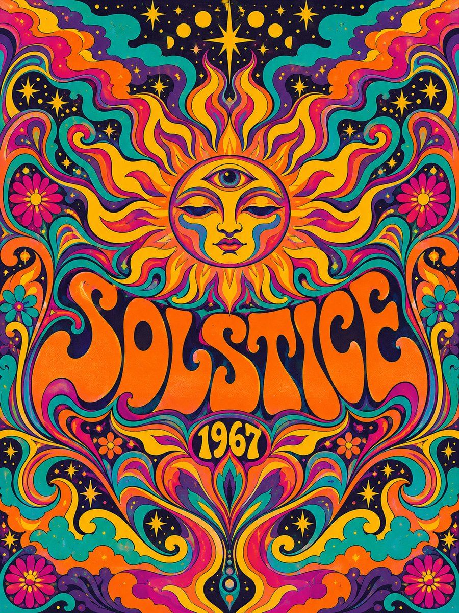
San Francisco, 1965-68. Wes Wilson made the first Fillmore posters for Bill Graham (he made about 56 between 1966 and 1968), adapting Viennese Secession lettering (Alfred Roller) so that letters melt into one another and fill all available space. Victor Moscoso, who studied under Josef Albers at Yale, took color theory into posters (Neon Rose, for the Matrix, 1967): saturated complementary colors that visibly vibrate. Bonnie MacLean was Fillmore's in-house artist from 1967 to 1971, with plumes, curving letters and stoic faces. Stanley Mouse, Alton Kelley and Rick Griffin did the same for the Family Dog and Avalon. The legend that Graham said "you can't read this" is an anecdote, but the point stands: viewers stopped to decode. It reacted to clean, legible, commercial 1950s advertising: the poster should be an experience, but it had to sell tickets.
Visual vocabulary
- Composition: symmetrical or radial, a central motif (arch, eye, flower, face-shaped frame) and a title wrapped into the shape. Almost no empty ground; every corner has ornament.
Fonts: Shrikhand, Chango, Rozha One, Fraunces, Work Sans
- Typography: Display: Shrikhand or Chango at 96-180 in a bulging, tight-leaded block; Rozha One for high-contrast fat face; Fraunces 600 (soft, italic) for secondary lines. Letterforms are fat, rounded and often touch; use negative letterspacing -2 to -4 percent and stack lines in the shape of a block, arch or ribbon (rotate each line a few degrees). Info text: Work Sans 500 at 18, uppercase small caps for date and venue.
- Color (variables): psyOrange #FF6A00 (30 percent), psyMagenta #E4007C (25 percent), psyViolet #5B2A86 (20 percent), psyTeal #00A7A0 (10 percent), psyYellow #FFD400 (10 percent), psyInk #1B1030 (5 percent), psyPaper #FFF1D6 (info strips). Complementary vibrating pairs: orange with blue-violet, magenta with green, red with teal. Use blocks of at least 80px or lines of 6px so the vibration is felt, never thin text on color.
- Shapes: concentric rings (stacked ellipses with alternating fills), sunburst rays (rotated thin rectangles), arches, petals (ellipses rotated around a center), repeated dots, wavy borders (paths). Strokes 2-4px in psyInk.
- Texture substitute: halftone dots as small ellipses grids at 20 percent alpha, offset-print misregistration with a duplicate shape offset 4px.
Pego recipes
- Landing hero (1440 x 800): center axis. Concentric rings behind (ellipses 900, 700, 500, alternating magenta, orange, violet). Title on top in Shrikhand 140 over 2 lines with a psyInk outline duplicate offset 6px. Info and a single CTA button sit on a $psyPaper strip below, set in Work Sans 18; the strip sits outside the vibrating zone.
- Poster / social post (1080 x 1350): arched frame (frame with large cornerRadius at top), band name filling the arch in 3 stacked rotated lines, flower or sun rays below, a bordered info strip across the bottom in $psyPaper with date and venue. Add a repeating wave path border.
- Event page: sticky-looking header with ring motif, then a schedule as bordered paper cards on $psyPaper, with each day's headline in Fraunces and a psyTeal bullet. Component: show-card, ring-motif.
Pitfalls
- Tie-dye neon gradient wallpaper and a peace-sign cliché: the original is flat color and hard outlines, no glow, no gradients.
- Vibrating color behind paragraphs causes eye strain and fails contrast. Calm info strips are required.
- Lettering that fills a shape but loses words: always check the screenshot at small size.
- Random swirls with no symmetry. Order and repetition create the trance.
- Do not caricature drug culture; the aesthetic is about music, light and community. Accessibility: avoid flicker or animation of vibrating pairs, provide plain text for essential info.
Pair with
warm-craft or bold-block tokens plus the social-media and event-focused landing-page skills. Keep info strips in a restrained style like newsprint for legibility.