THE FULL SKILL
This is the text the agent reads before it designs.
Essence
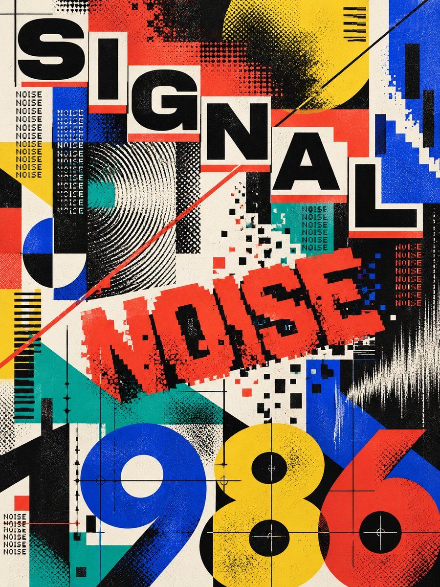
In the early 1970s Wolfgang Weingart, teaching at the Basel School of Design from 1968, began to push the Swiss International Style past its limits: letterspacing opened or collapsed, weights mixed inside a word, text set at non-right angles, lines stepped, film layers overprinted. His students (April Greiman, Dan Friedman, Willi Kunz) and Cranbrook's Katherine McCoy carried it out of Switzerland, and people called it New Wave or Swiss Punk. Greiman moved to Los Angeles in 1976 and, with an early Macintosh, produced Design Quarterly 133 (1986): a fold-out poster about 64 x 193 cm with a layered self-portrait, timeline and video stills. In Berkeley, Zuzana Licko and Rudy VanderLans ran Emigre (1984-2005), setting bitmap fonts on the Mac and igniting the Legibility Wars ("you read best what you read most"). It reacts against neutral, orderly Swiss modernism: structure became material to play with, not a cage.
Visual vocabulary
- Composition: a grid exists, then is stressed: modules slide off it, a column is cut by a diagonal, a bar crosses a headline. Space is shallow and layered, like film transparencies. Large empty areas next to dense knots.
Fonts: Space Grotesk, Libre Franklin, Space Mono, Silkscreen, Libre Baskerville
- Typography: Neutral grotesque at extreme scales (Libre Franklin 900 at 160+ next to 11-12 caps), Space Mono for notes and numbers, Silkscreen for a bitmap-label nod (labels only), and a serif such as Libre Baskerville (Mrs Eaves-like voice) for reading text. Mix weight inside a word, step baselines in 2-3 stairs (translate each line 24-48px), rotate a single block 90 or 15 degrees.
- Color (variables): nwPaper #F4F0E8 (60 percent), nwInk #0E0E10, nwRed #E63B2E, nwBlue #1F4FD8, nwYellow #F2C230, nwTeal #14A3A0 (accent 10-15 percent combined). Greiman's California light suggests pastels (pink #F2A6B8, aqua #7FD6D0) as tints for transparent bars.
- Shapes and textures: thin rules, bars, circles and squares as pure geometry, dot-screen (halftone) from a grid of small ellipses, color planes at 70-85 percent alpha hex (such as #1F4FD8CC) to mimic overprint and film layers, a timeline strip with ticks. Strokes 1-2px.
Pego recipes
- Landing hero (1440 x 820): a frame with layout none, fill $nwPaper. Headline 3 lines in Libre Franklin 900 at 150, stepped x offsets (80, 140, 200). A translucent $nwBlue bar (width 1440, height 120, alpha 80) crosses the second line; a $nwRed circle 260 overlaps behind it; a rotated -90 mono caption on the left edge. Support copy in Libre Baskerville 20 in a plain 520px frame, button black with mono label.
- Poster / social post (1080 x 1350): giant numeral or word cropped by the frame edge (clip true), two layers of overlapping type in black and red with alpha, small mono data block (date, place) aligned to a column on the right, halftone dots grid fading across the lower third.
- Event page: the grid is shown as hairline vertical rules; the schedule is a table in Space Mono with oversized time numerals; speaker names step down the page. Components: schedule-row, tag-label. Keep real content in plain vertical frames.
Pitfalls
- Random rotation and overlap with no grid behind it: this is not "chaos", it is a mess. Identify the axes first.
- Overlap on body text, or a bitmap font for paragraphs. Bitmap faces are for labels and display only.
- Using Weingart's tools as a filter on everything: restrain to one focal composition per screen.
- Fake glitch and neon. The original was ink, film and early Mac pixels.
- Accessibility: blend modes never reduce contrast below 4.5:1 for text, and the reading order must follow the visual story from top to bottom.
Pair with
swiss-grid style tokens and the landing-page, social-media and slides skills. For editorial pages pair with newsprint; for a calmer variant keep layering to one transparency bar and one rotated element.