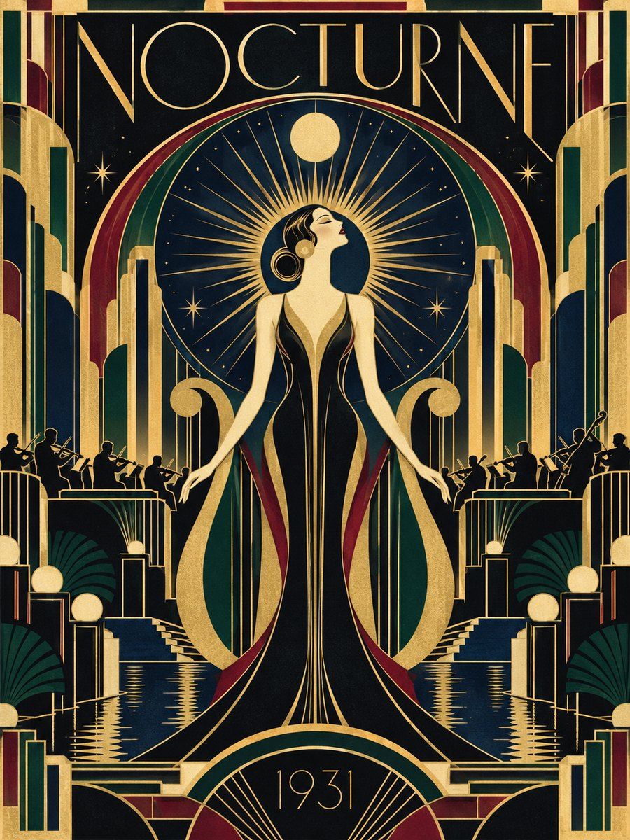
THE FULL SKILL
This is the text the agent reads before it designs.
Essence
Named after the 1925 Exposition Internationale des Arts Decoratifs et Industriels Modernes in Paris (the Met notes that entries had to be modern, not historical copies), flourishing through the 1930s in Paris, New York and Shanghai: Ruhlmann furniture, Lalique glass, Cassandre posters, the Chrysler and Empire State towers. Idea: luxury through the machine age. Rich materials and manufactured precision, straight lines instead of Art Nouveau curves, symmetry because it suits machine production, themes of speed, flight, jazz and travel. Streamline moderne is its later, smoother sibling.
Visual vocabulary
- Composition: symmetric on a vertical axis, framed panels, stepped (ziggurat) silhouettes, radiating fans or sunbursts behind a central subject, parallel multi-line borders. Poster work by Cassandre uses bold simplified forms, sharp angles and strong perspective.
- Typography: tall, geometric display caps with extreme contrast of thick and thin, or monoline geometric with wide tracking. Fonts: Poiret One, Limelight, Federo, Cinzel, Forum, Marcellus, Josefin Sans
Roles: Limelight or Poiret One for 56-110 px titles, tracking +4% to +10%, all caps for titles; Cinzel or Forum for subtitles 18-28 px caps with +12% tracking; Josefin Sans 400 at 17-18 for body. Numerals in gold. - Color: black #0e0e12 or deep navy #10213a or emerald #0f3d33 (60%), cream #f3ead3 (25%), gold #c9a24b (8-12%), optional burgundy #6b1d2a or teal #1f6f6b as a single accent.
- Shapes: sunburst rays, chevrons, concentric arches, stepped rectangles, fan scallops, thin double rules with corner notches, octagon frames.
- Imagery: stylized figures, sleek vehicles, skyscrapers as silhouettes, engraved or flat vector illustration; photography in black and white with gold overlays. Icons: monoline 1.5-2 px inside circles or octagons.
In Pego
- Variables: $ink #0e0e12, $navy #10213a, $cream #f3ead3, $gold #c9a24b, $accent #6b1d2a, $radius 0.
- Landing hero (1440x820): frame layout none, fill $ink. Centered column frame (vertical, alignItems center, gap 20, width 720). Top: a small gold emblem (diamond rectangle rotated 45, 18 px) flanked by two 120 px gold rules (height 1.5). Title Limelight 96 caps, fill $cream; subtitle Cinzel 22 +12% tracking in $gold; one button with 2 px $gold border, transparent fill, gold caps text, radius 0. Behind the title a sunburst made from 12 thin rectangles (width 1.5, height 900, $gold at 30% alpha) each rotated by 15-degree steps around the center, clipped by the frame. Stepped corner ornaments made of three nested rectangles.
- Poster/social post (1080x1350): navy ground, a double gold border inset 40 and 52 px with corner notches, a central silhouette (tower, car, figure) in cream, event name at 80 px caps, a date row at the bottom between two rules.
- App screen: dark $navy shell, cards with 1 px $gold stroke and chamfer-free square corners, gold only for section dividers and key numbers; headings Forum caps, data in Josefin Sans. Keep ornament in the header and empty states.
- Make reusable: divider (rules plus diamond), border frame, emblem, gold button, section header.
Pitfalls
- Gatsby party cliché: glitter, fringe, champagne coupes, neon. Keep it architectural and restrained.
- Mixing in Art Nouveau curves and florals, or Victorian script.
- Gold text on cream or white: contrast fails. Gold goes on dark, or use darker bronze #8a6a1f on cream.
- Thin 1 px gold on small images and light display faces below 36 px get lost; keep titles large.
- Ornament overload: if the decoration is bigger than the content, cut half.
Pair with
Suits brand-identity, invitations/events, restaurant or hotel landing-page, luxury product poster, slides for a gala or cocktail menu. Fights: dense dashboards, playful or brutalist moods, bauhaus (anti-ornament).