THE FULL SKILL
This is the text the agent reads before it designs.
Essence
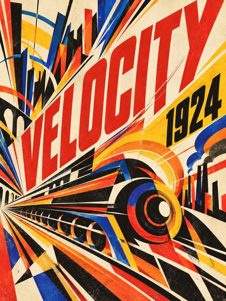
Milan, 1909: Filippo Tommaso Marinetti published the Futurist Manifesto on the front page of Le Figaro (20 February 1909), glorifying speed, machine and the modern city. Painters Balla, Boccioni, Carra, Severini followed; in print, Marinetti's parole in liberta (about 1912-14, e.g. Zang Tumb Tumb, 1914) broke syntax and let words act as sound and motion. Fortunato Depero's bolted book Depero Futurista (1927) turned the book into a machine. Idea: simultaneity, dynamism, noise; the page should vibrate. Note the movement's links to nationalism and war; borrow the formal language, not the politics.
Visual vocabulary
- Composition: diagonals, radiating lines, spirals and concentric arcs, overlapping planes that suggest motion; type scattered along curves and angles; dense but organized by a dominant thrust.
- Typography: heavy sans and slab, mixed in one block, sizes jumping 3-5x, some words stretched or stacked, onomatopoeia and numbers as shapes. Fonts: Bebas Neue, Anton, Archivo Black, Alfa Slab One, Oswald, Space Mono
Roles: Anton or Bebas Neue 120-240 caps for the shout; Alfa Slab One for one contrast word; Oswald 500 caps 28-40 for secondary lines; Space Mono 400 at 16-18 for facts and body. Each text run keeps lineHeight 0.9-1.1 and stays straight. - Color: cream #f2ead8 (40-50%), black #121212 (25%), red #e0201b (15%), yellow #f5c400 or blue #1b3d9b (10%), optional orange #ee6a1a for heat.
- Shapes: wedges, zigzag, concentric rings, speed stripes, gears, comet streaks, cut-off circles; flat fills with hard edges; overlapping at 70-90% opacity.
- Imagery: machines, cars, planes, cities, crowds as flat shapes with multiple ghosted copies for motion; high-contrast halftone photography. Icons: solid geometric, tilted 8-15 degrees.
In Pego
- Variables: $cream #f2ead8, $black #121212, $red #e0201b, $yellow #f5c400, $blue #1b3d9b, $radius 0.
- Landing hero (1440x820): frame layout none, fill $cream. Radiating force lines (10 rectangles, height 1200, width 14 to 40, alternating $red and $black, rotated -50 to -20 around the lower left). Giant headline 200 Anton, black, rotated -6, with one word in an overlapping $yellow bar. Support copy straight in Space Mono 18 inside a flat $cream panel with a 4 px black border; one CTA: fill $red, white caps text, radius 0, height 56. Keep nav straight and quiet.
- Poster/social post (1080x1350): center subject (circle or machine silhouette) with three offset ghost copies to imply movement; words in freedom around it at 3 sizes and 3 angles from a defined set (0, -15, 90); factual line at the bottom on a black bar. Limit to 6-9 text runs.
- App screen: use as accent only. Orthogonal layout, condensed caps headings, a diagonal wedge in the header and a speedline progress indicator; no tilted data or controls.
- Make reusable: force-line fan, wedge, caps heading, button, ghost-copy shape set.
Pitfalls
- Chaos without hierarchy: kinetic text where nothing can be read. One shout, one secondary, one fact line.
- Costume futurism: retro-sci-fi chrome, neon, 80s synthwave; this is flat ink on paper.
- Overlapping text on text, or rotated paragraphs: breaks legibility and screen readers; keep real text, keep paragraphs straight and 16 px or larger.
- Red on black, yellow on white as small text: low contrast. Put text on cream or black bars.
- Political imagery or war glorification in modern content: avoid.
Pair with
Suits poster/social-media, event and music promos, landing-page for sports, mobility, energy or hardware launches, slides with one big statement each, motion titles. Fights: calm editorial, healthcare, finance, botanical and wellness moods, art-deco elegance.