THE FULL SKILL
This is the text the agent reads before it designs.
Essence
Europe and the US, about 1890 to 1910: Mucha's 1895 Gismonda poster for Sarah Bernhardt, Beardsley's Salome drawings (1893), Horta's Tassel House in Brussels, Guimard's Paris Metro entrances, Obrist's whiplash embroidery (1895), Jugendstil in Munich and the Vienna Secession (Klimt, Hoffmann, Olbrich), Gaudi in Barcelona. Idea: unite art and everyday life with nature as source; new materials (iron, glass) shaped into vines; the total work where building, furniture, poster and typography share one line. German and Austrian branches became more geometric after 1900.
Visual vocabulary
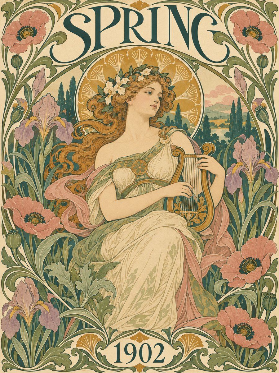
- Composition: a central figure or motif inside an arched, rectangular or circular frame; curving stems wrapping the frame; asymmetry within a balanced layout. Vertical, narrow poster formats are typical. Whitespace is replaced by decorative field, but text zones stay clean.
- Typography: custom, hand-lettered feel with swelling curves, or old-style serif. Fonts: Cormorant Garamond, Fraunces, Gilda Display, Cinzel Decorative, Rufina, Sansita
Roles: Fraunces or Gilda Display 48-96 px for titles, mixed case; Cinzel Decorative only for a short top line at 24-32; Cormorant Garamond 500 at 20 or Rufina 400 at 17-18 for body. Slight negative tracking on titles, +2% on small caps. - Color: parchment #efe3c8 (50%), olive #6f7a4a and sage #a6b08a (20%), dusty rose #d9a39a (10%), ochre #c78b2e (8%), deep teal #1e4d4a or aubergine #3c2a3e for ink (10-15%), outline ink #2b2118.
- Shapes: whiplash S-curve, tendrils, lilies, irises, peacock feathers, dragonflies, long flowing hair, mosaic roundels, arches, 3-4 px outlines with flat fills in the Mucha manner.
- Imagery: stylized female figures in profile or three-quarter, flat fills with dark outlines, halo-like circular motif behind head; plants rather than photos. Icons: line icons with curved terminals.
In Pego
- Variables: $parchment #efe3c8, $olive #6f7a4a, $sage #a6b08a, $rose #d9a39a, $ochre #c78b2e, $ink #2b2118, $teal #1e4d4a, $radius-frame 160 (arch top).
- Landing hero (1440x820): frame layout none, fill $parchment. Left: text stack (vertical, gap 20, x 120, y 200, width 560): small Cinzel Decorative label, Fraunces 80 title, Rufina 18 body, button with fill $teal, parchment text, radius 999. Right: an arch frame (frame 520x680 with cornerRadius [260, 260, 0, 0], stroke $ink 4, fill $sage) holding an image or icon-cluster; path nodes drawn as curved stems and leaves outside the frame (stroke $olive 3, ellipses fill $rose as blossoms). Ornament paths and ellipses are grouped, set behind text.
- Poster/social post (1080x1350): vertical format, circular halo (ellipse 520, fill $ochre at 70%) behind a central figure, double inner border (stroke $ink 4, inset 36), title at the top in a lettering band, small text block at the bottom with a floral divider.
- App screen: calm field in $parchment, cards with 2 px $ink border and generous 24 radius, section headings in Fraunces, ornament limited to one corner flourish and empty states; actions in $teal. Keep data views plain.
- Make reusable: arch frame, divider flourish, leaf-corner ornament, button, label.
Pitfalls
- Cutesy Victorian floral or wedding-invitation look; Art Nouveau lines are tense and sinuous, not fluffy.
- Ornament under text: patterns behind paragraphs ruin contrast. Use flat panels.
- Low-contrast sage on parchment for small text; use $ink on parchment (above 7:1) and cream on teal or aubergine.
- Mixing in Art Deco symmetry and gold sunburst, or Bauhaus primaries.
- Too many different curve styles: pick one stem thickness and a few repeating leaf shapes; keep text 17 px or larger.
Pair with
Suits brand-identity for tea, botanicals, perfume, bakeries, theatre, wedding and event posters, landing-page for craft products, book covers. Fights: data-dense dashboards, tech-minimal, swiss-grid and bauhaus moods.