THE FULL SKILL
This is the text the agent reads before it designs.
Essence
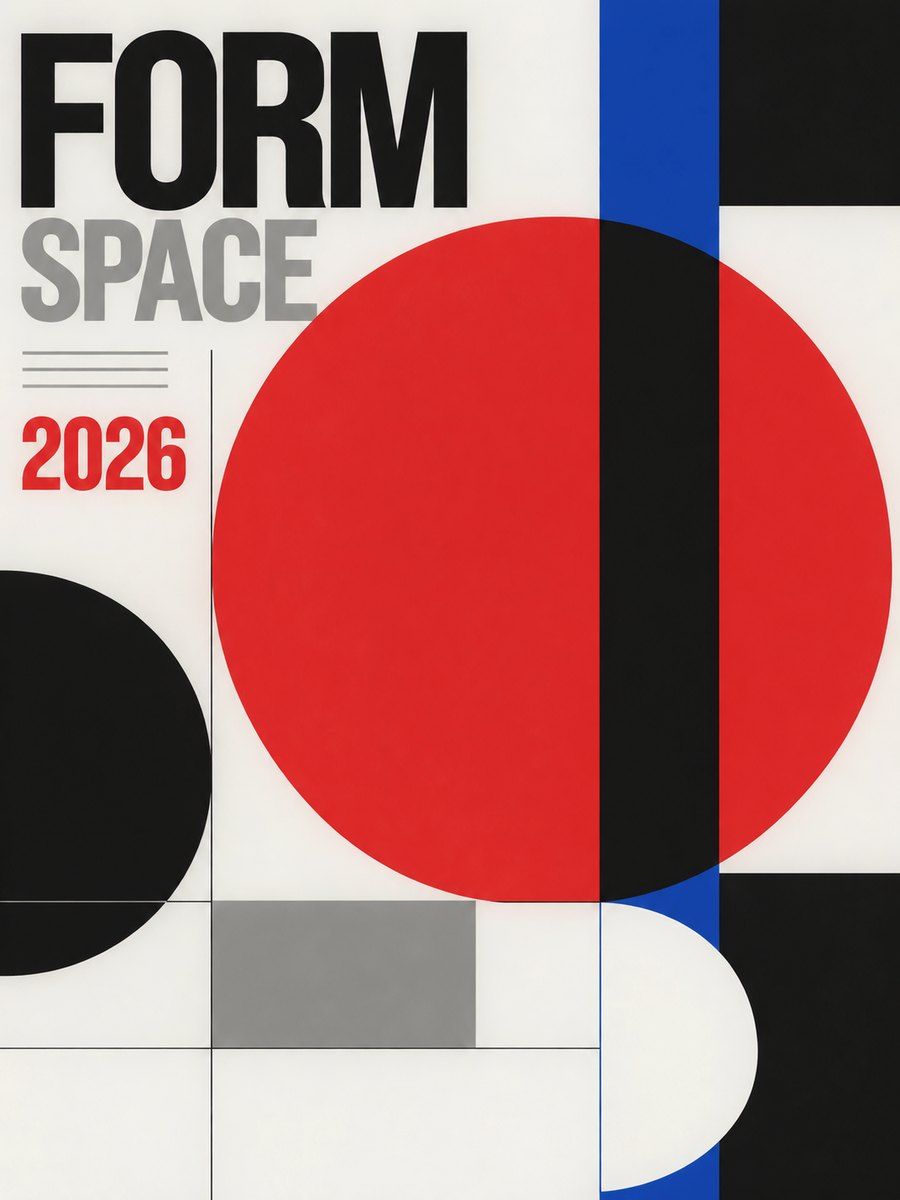
Born in Zurich and Basel in the late 1930s to 1950s (Ernst Keller, Max Bill, then Josef Müller-Brockmann, Armin Hofmann, Emil Ruder) and carried worldwide by the journal Neue Grafik (1958) and by corporate identity in the 1960s. The idea: design is an objective, almost scientific way to organize information. The designer's ego steps back; the grid, the type and the content do the work. Order is the beauty.
Visual vocabulary
- Grid: every layout sits on a modular grid. Müller-Brockmann derives rows from the baseline of the text and calls modules "fields"; the grid's position in the page matters as much as its content. Typical: 4 to 8 columns, gutter equal to one baseline unit, generous outer margins.
- Composition: asymmetry, one dominant element, diagonal tension from scale or rotation of a single object, large empty fields. Rhythm comes from repetition of one module.
- Type: Akzidenz-Grotesk, Univers, Helvetica. Flush left, ragged right, lowercase or sentence case, tight but even leading, scale contrast over weight contrast. Closest on Google Fonts below.
Fonts: Inter Tight (display), Archivo, Instrument Sans, Work Sans, IBM Plex Mono (data)
- Color: paper white $bg #F4F2EE, ink $text #111111, one accent $accent (signal red #E3242B or blue #0B3FBF), a grey #8A8A86 for secondary. Proportions about 75 white, 20 black, 5 accent.
- Imagery: objective photography, cropped hard, black and white or full color; geometric abstraction; no illustration flourishes. Photo and type are either closely related in form or deliberately contrasted (Ruder).
- Icons: avoid or use plain geometric glyphs and numerals.
In Pego
Set variables: $bg, $text, $accent, $muted, $rule, $space-1 (8), $space-2 (16), $space-4 (32), $margin (64), radius 0.
- Grid in Pego: a page frame (layout none for posters, vertical for web), width 1440, padding [0, 64]. Build the grid as a row frame with 12 child column frames (fill_container, gap 24) only as a guide, then place content in row frames using the same fractions; delete guides when done. Do not rely on x and y except in posters.
- Landing hero: row, two zones: left 4 of 12 columns holds a small numbered label, 14 / weight 500, and a 2-line support paragraph; right 8 columns holds the headline at 96-128, weight 600, lineHeight 0.95-1.0, flush left, 3-6 words. Top rule: rectangle height 2, fill $text, width fill_container. One button: rectangle-style frame, radius 0, fill $accent, label in $bg. A single large image or a huge numeral below, cropped to the grid.
- Product or app screen: left column 2 of 12 for navigation as plain text rows (no icons), main area 7 columns, tables as rows separated by 1px rule rectangles ($rule), numerals in IBM Plex Mono. Selected state is a 4px $accent bar, not a filled pill.
- Poster or social post: square or 4:5 frame, layout none. One huge element (a 200-400 size word, number or a cut photo) bleeding off an edge; a 3-line caption in the lower-left grid cell at 16; a thin top rule; accent used once. Keep a 40-48 margin and align baselines of captions across columns.
Pitfalls
- Centered everything, rounded cards, shadows and gradients: that is not Swiss, that is generic.
- "Helvetica on white" without a grid or scale contrast is only bland. The tension comes from size, position and emptiness.
- Fake rotated text everywhere; use rotation or diagonals once.
- Too many columns of equal weight: pick a dominant one.
- Accessibility: tiny grey captions and thin light weights fail contrast; keep body at 14+ with 4.5:1, keep reading order matching grid order for screen readers.
Pair with
landing-page (hero as type + empty field), web-app and dashboard (rows and rules instead of cards, mono numerals), slides (one idea per slide on a 12-column grid), brand-identity (wordmark in the grotesque, a strict spacing system), social-media (one huge element, one caption).