THE FULL SKILL
This is the text the agent reads before it designs.
Essence
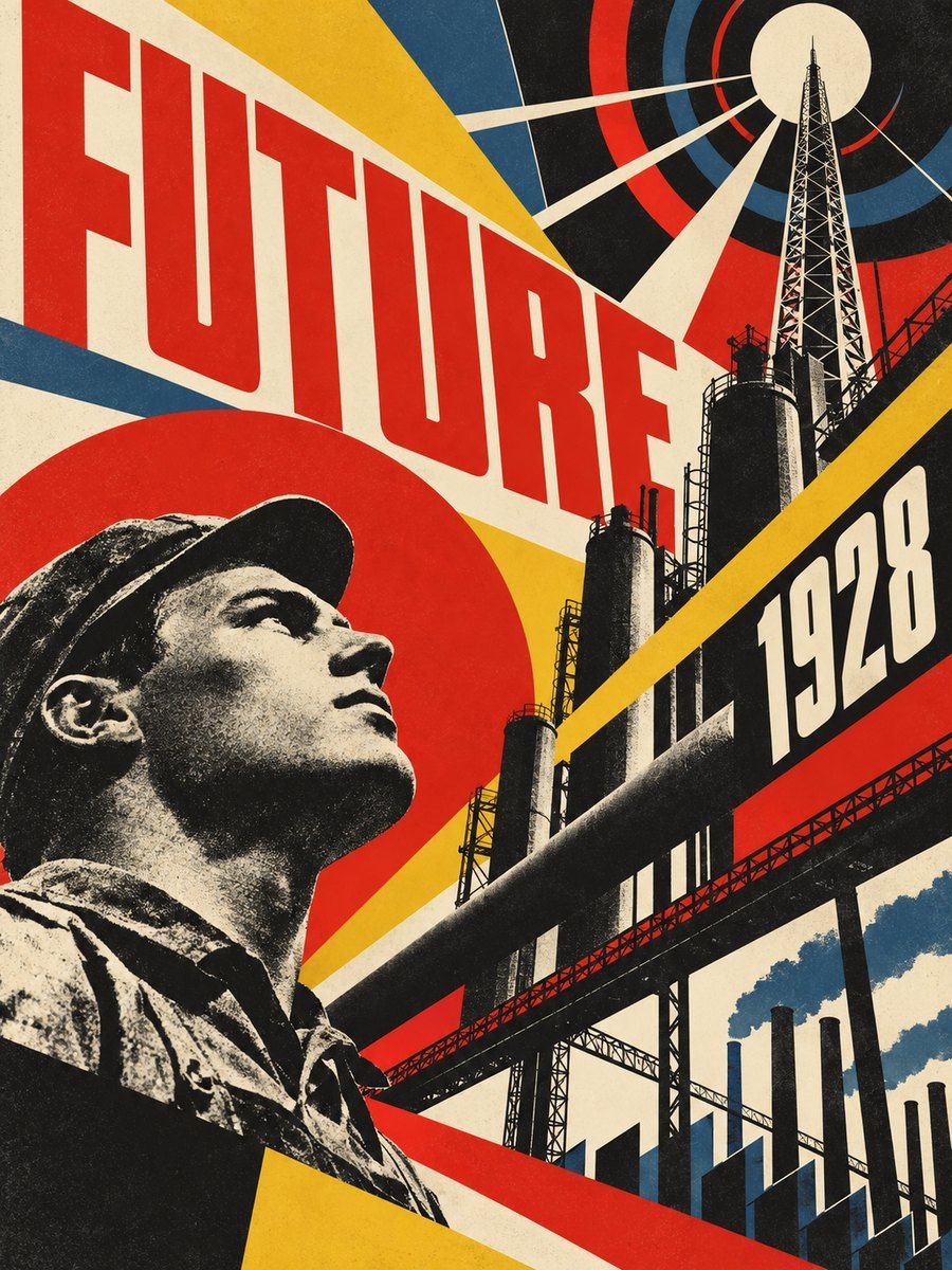
Moscow and Petrograd, c. 1919 to the early 1930s: Rodchenko, Stepanova, Lissitzky, the Stenberg brothers and others put Malevich's suprematist geometry to work for the revolution (Lissitzky's Beat the Whites with the Red Wedge, 1919; Of Two Squares, 1922; Rodchenko's Dobrolet airline poster, 1923). Idea: art is construction, not decoration. A poster is a machine for persuading an audience that is often barely literate, so shape, color and direction do the speaking; text is a tool, set big and short.
Visual vocabulary
- Composition: dynamic diagonals, wedges, circles as targets, text blocks angled on the same axis. Overlapping planes, elements bleed off the page. Asymmetry and tension, but with one clear read path (usually bottom-left to top-right).
- Typography: heavy grotesque or condensed sans, caps, sometimes hand-cut geometric shapes. Mixed sizes in a single message, with words stacked or rotated. Fonts: Oswald, Anton, Archivo Black, Barlow Condensed, Staatliches
Roles: Anton or Archivo Black for headlines 96-200 px; Oswald 500-700 caps for sub-lines; Barlow Condensed 400-500 for facts at 18-22 px. Tracking 0 to +2% for caps; lineHeight 0.9-1.0. - Color: cream #efe6d2 (45-60%), black #151515 (20-30%), red #d9261c (15-25%). Optional yellow #e8b923 or steel blue #2f4f6e for small accents.
- Shapes: wedge triangle, circle, long bars, concentric arcs, thin hairlines for measurement and axes; stars and gears as sparse stamps.
- Imagery: photomontage in duotone black and red, heads and hands cut out to a hard edge, pointing or shouting gestures. Icons: solid, geometric, no outlines.
In Pego
- Variables: $cream #efe6d2, $black #151515, $red #d9261c, $yellow #e8b923, $radius 0, $bar 32.
- Landing hero (1440x820): frame layout none, fill $cream. Red wedge (path triangle or rectangle rotated -24, fill $red) cutting from lower left; a black bar (rectangle 900x$bar rotated -24) crossing it; headline in Anton 140 caps in a frame rotated -8, with one word in a $black bar with $cream text. Support copy straight (not rotated) in Barlow Condensed 22. One CTA: fill $black, text $cream, radius 0, height 56, caps.
- Poster/social post (1080x1350): background $cream, a circle ($red, 700) offset to the top right, a duotone photo clipped in a rotated frame, a diagonal slogan block in 3 lines (imperative, 3-5 words), a tiny facts row at the bottom set straight with a 4 px black rule above.
- App screen: keep the structure orthogonal and use the style as accents only: a black header bar with caps labels, red active-state bar, section titles in condensed caps, one rotated stamp-like status chip. Do not rotate working UI.
- Make reusable: bar, wedge, caps label chip, button, stamp.
Pitfalls
- Costume pastiche: hammer and sickle, Cyrillic faux-letters (reversed R, N), and USSR iconography are political; use the formal language, not the symbols, unless the brief wants them.
- Everything rotated: pick one angle and reuse it; rotated body text is unreadable.
- Red on black text and thin condensed text on busy images fail contrast; put text on cream or a flat bar.
- Mixing in Art Deco gold, soft rounded sans or glassy gradients.
- Keep the message accessible: real text for all slogans, min body 16 px, ensure focus outline 3 px black on cream.
Pair with
Suits poster/social-media, event pages, landing-page for campaigns, slides for manifestos, album or film covers. Fights: calm SaaS, wellness, luxury or children's brands, long text-heavy documents.