THE FULL SKILL
This is the text the agent reads before it designs.
Essence
Rams joined Braun in 1955 and led its design from 1961 to 1997. Working with Fritz Eichler, Hans Gugelot and Otl Aicher (Ulm School of Design, 1953-68), he made radios, record players, calculators and shelves that were calm, precise tools. The motto is "Less, but better" and the ten principles of good design (as Vitsœ presents them): innovative, useful, aesthetic, understandable, unobtrusive, honest, long-lasting, thorough, environmentally friendly, and as little design as possible. The product steps back so the person can act.
Visual vocabulary
- Grid: strict modular layout, controls grouped by function on an even module (Braun panels, Aicher's systems). Alignment and consistent gaps are the decoration.
- Type: Akzidenz-Grotesk on Braun, mostly lowercase, small and quiet, labels sit tight to their control.
Fonts: Inter Tight (UI and labels), Hanken Grotesk, Archivo, IBM Plex Sans, IBM Plex Mono (numbers)
- Color: light warm grey $bg #E9E8E4, surface #F6F5F2, mid grey $muted #8C8B86, black $text #1A1A1A, one signal color $accent used sparingly (orange #E8590C, or a Braun-like yellow #F2C200 or green #2E9E5B for a state). 80 neutral, 15 black, under 5 accent.
- Shapes: rectangles with a small radius (2-6), circles for dials and round buttons, concentric rings; real-object proportion, no skeuomorphic texture.
- Imagery and icons: product on a quiet neutral ground, or plain diagrams; icons simple, 1.5px stroke, always with a word label.
Ten principles as UI decisions
- Useful and as little design as possible: every element earns its place; no hero decoration.
- Understandable: affordances are obvious, a dial looks turnable, a switch shows its state; no instructions needed.
- Honest: no fake urgency, no "AI magic" badges, claims in plain numbers; disabled means visibly disabled.
- Unobtrusive: neutral palette, content owns the color; notifications are quiet.
- Thorough: consistent spacing and radius from variables, aligned baselines, empty states and error states designed too.
- Long-lasting: no trend effects (glass, neon, glow); one timeless scale.
- Aesthetic: beauty is proportion and exactness, not ornament.
- Innovative and environmentally friendly: fewer assets, light pages, low-energy dark/light options without gimmicks.
In Pego
Variables: $bg, $surface, $text, $muted, $accent, $rule #CFCDC7, radius 4, space 8/16/24/32.
- Landing hero: vertical, padding [96, 80], product (or a precise Pego-built device panel) left in a $surface frame radius 4, text right: 48 / weight 500 headline, one 17 support line, one accent button, radius 4, height 48. Spec table below: two-column rows separated by 1px rule rectangles.
- App screen: control panel layout: a vertical stack of grouped sections, each a frame with a small label (12, $muted) above a row of controls; segmented controls and toggles with clear on/off labels; primary action single, bottom-right.
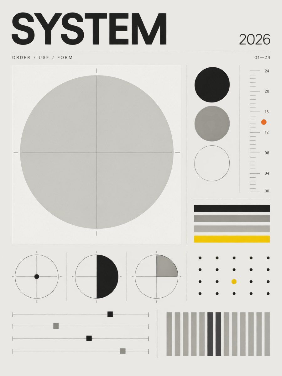
- Poster or social: $bg field, product or one geometric form centered on a module, a name and model number in 14 lowercase, a thin rule, the accent only as a tiny dot or ring. Nothing else.
Pitfalls
- Minimalism by stripping labels: affordance and clarity come first.
- Copying Braun's orange everywhere; the accent is a signal, not a theme.
- Cold sterile whites; Braun greys are warm.
- Accessibility: pale grey labels on grey fail contrast; keep 4.5:1 and give state by shape or text as well as color.
Pair with
dashboard and web-app (grouped control panels, quiet tables), design-system (variables and strict scales), brand-identity (name plus restraint), landing-page (spec-led product pages), mobile-app (one action per screen), slides (calm grid, product as hero).