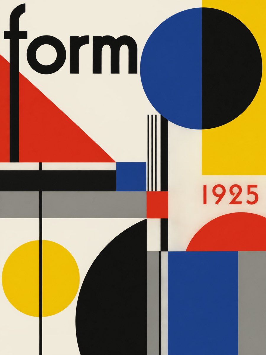
THE FULL SKILL
This is the text the agent reads before it designs.
Essence
Staatliches Bauhaus, founded by Walter Gropius in Weimar in 1919, moved to Dessau in 1925, closed under Nazi pressure in Berlin in 1933. Typography only became a formal workshop in 1925 under Herbert Bayer; Moholy-Nagy (from 1923) brought the constructivist influence, Joost Schmidt took over in 1928. Idea: form follows function, one language for art, craft and industry. Reduce to the elemental (circle, triangle, square; red, yellow, blue) and organize by contrast of size, weight, direction. The look is engineered, not decorated.
Visual vocabulary
- Composition: asymmetric balance, strong horizontal and vertical axes, one diagonal at 15-45 degrees for energy. Heavy black bars as structure and as reading guides. Big empty off-white field; elements cluster, not scatter.
- Typography: geometric or grotesque sans, lowercase or very sparing capitals (Bayer's Universal 1925 was single-case). Fonts: Josefin Sans, Jost, League Spartan, Archivo Black, Work Sans
Roles: Jost or League Spartan 600-800 for headlines, 56-120 px, tracking -2% to 0, lineHeight 0.95-1.05. Work Sans 400 at 18-20 for body. Bold words may sit on a black bar in white. Text may run vertical (rotation -90) or on the diagonal, once per page. - Color: ground #f1ebdc (60-70%), ink #111111 (15-20%), red #d62718, yellow #f2c200, blue #1f3f8f (together 10-20%, each used as a flat block). Optional grey #8c8c86 for captions.
- Shapes: full circle, half circle, right triangle, square, thick bar (height 24-72) and thin rule (2-4). Overlap shapes for depth, no outlines unless 3-4 px black.
- Imagery: black and white photography, high contrast, unusual angles (bird's eye, worm's eye), photomontage with flat shapes. Icons: solid geometric, 2 colors max, no rounded line icons.
In Pego
- Variables: $paper #f1ebdc, $ink #111111, $red #d62718, $yellow #f2c200, $blue #1f3f8f, $radius 0, $gap-s 16, $gap-l 64.
- Landing hero (1440): frame layout none, height 760, fill $paper. Left: text frame (vertical, gap 24, x 80, y 200, width 560) with lowercase headline, one support line, one button (fill $red, radius 0, height 56, text white 700). Right: a shape composition made from a circle (fill $yellow, 380), a square ($blue, 300) and a right triangle path ($red) overlapping, plus a rectangle bar ($ink, width 560, height 40) rotated -12. Thin rule (rectangle height 4, $ink) under the nav.
- Poster / social post (1080x1350): layout none. Giant word at 280-340 px weight 800 lowercase, cropped by the frame edge; a red circle behind it; one black bar carrying date or place at 28 px white. Small caption block bottom left, 16-18 px grey-on-paper or ink-on-paper.
- App screen: vertical shell, left rail 96 wide fill $ink with white icons, content on $paper in 12-column grid, cards with fill white and a 4 px black bottom bar instead of shadow. Charts with only the three primaries plus ink.
- Make reusable: button, bar-heading (bar rectangle plus label), shape badge, nav link.
Pitfalls
- Costume Bauhaus: Fraktur, ornament, sepia grunge, or 1970s rounded type. Remove.
- Primary red or blue as body-text color on yellow or each other: fails contrast. Use ink on yellow, white on blue or red, never red on blue.
- Overusing diagonals or rotating more than two elements turns it into constructivism or futurism.
- Gradients, glass, soft shadows, pill buttons are anachronisms; flat only.
- Keep body text 16-18 px minimum, line length 45-70 characters, and give interactive elements a visible focus (4 px black outline).
Pair with
Suits poster/social-media, brand-identity, landing-page with one bold hero, slides with a block per slide, portfolio. Fights: soft SaaS dashboards, wellness or botanical brand moods, anything needing warmth and ornament.