THE FULL SKILL
This is the text the agent reads before it designs.
Essence
Netherlands, 1917: Theo van Doesburg founded the journal De Stijl with Piet Mondrian, Bart van der Leck, Vilmos Huszar and architects such as J.J.P. Oud and Gerrit Rietveld; the 1918 manifesto followed. Mondrian called the doctrine neoplasticism. Idea: universal harmony through the fewest means: straight horizontal and vertical lines, primary colors plus black, white and grey, balance by opposition instead of symmetry. Rietveld's Schroder House (1923-24) is the built proof. In 1924 van Doesburg moved to the diagonal (elementarism) and Mondrian broke with him; use the diagonal only if the brief wants that later phase.
Visual vocabulary
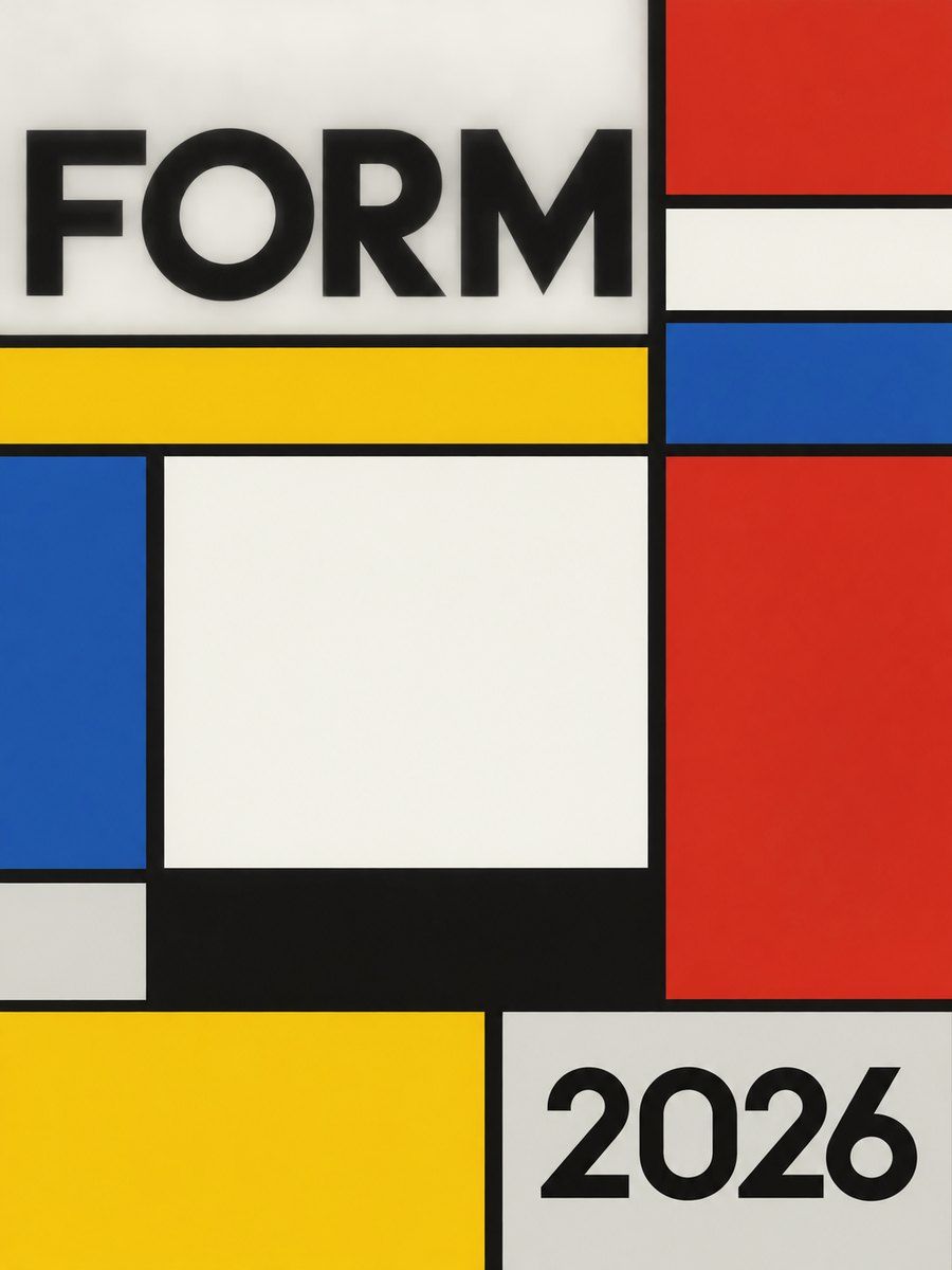
- Composition: a grid of rectangles divided by black lines; lines may run off the edge, planes are unequal, colored planes are few and sit off-center. Weight is balanced against a large white field. No center, no frame, no symmetry.
- Typography: blocky, built-from-rectangles lettering in the journal; for UI use geometric sans in all lowercase or caps. Fonts: Jost, Josefin Sans, Archivo, Space Grotesk, Syncopate
Roles: Archivo or Jost 700-800 for headlines at 48-96 px, tracking 0, caps allowed in short labels at +6%. Body Jost or Work Sans-like 400 at 18. Set text flush left, aligned to plane edges, in black on white. - Color: white #f7f5ee (50-60%), light grey #d9d7cf (5-10%), black #101010 lines (10%), red #cc2a1f, yellow #f4c20d, blue #1d4e9e (together under 20%; one dominant accent per screen).
- Shapes: rectangles only. Lines 6-16 px, thicker for primary dividers, thin 4 px for secondary.
- Imagery: none, or architectural photography cropped to a rectangle plane. Icons: built from squares and bars, 2-3 px black stroke or solid blocks.
In Pego
- Variables: $white #f7f5ee, $grey #d9d7cf, $black #101010, $red #cc2a1f, $yellow #f4c20d, $blue #1d4e9e, $line 10, $radius 0.
- Landing hero (1440x800): frame layout none, fill $white. Build the Mondrian grid with rectangles: a vertical $black bar x 880 width 10 full height, horizontal bars at y 520 (full width) and y 240 (x 880 to 1440). Planes: $red x 0 y 0 880x520 only if it carries no text, $blue small plane bottom right 200x150, $yellow 120x90. Text goes in a white plane left: headline 72 / 800, one line support, one button with fill $black, white text, radius 0.
- Poster/social (1080x1350): layout none, 5-7 rectangles total, lines running off all four edges, one text block in a white cell, bottom caption in a black cell with white 20 px text.
- App screen: the layout itself is the style. Horizontal flex rows separated by 8 px $black dividers; sidebar a white plane, active state a yellow plane, primary action red or blue block. Tables use black rules only. Charts use only the three colors plus black.
- Make reusable: divider (vertical, horizontal), plane (frame with variable fill), button, nav item.
Pitfalls
- Random Mondrian knock-off with six colors or colored lines: keep lines black and colors few.
- Putting body text on red or blue (poor contrast for small sizes) or red text on blue.
- Symmetric layouts, rounded corners, drop shadows break the idea.
- Too many planes make it noisy; if more than 7 rectangles, merge.
- Accessibility: keep text on white or black; planes colored for emphasis, not information alone; focus ring 4 px black outline.
Pair with
Suits poster/social-media, brand-identity, portfolio, landing-page with a modular hero, dashboard-like grids. Pairs well with architecture and furniture brands. Fights: ornate, organic or luxury moods (art-nouveau, art-deco), long-form editorial reading.