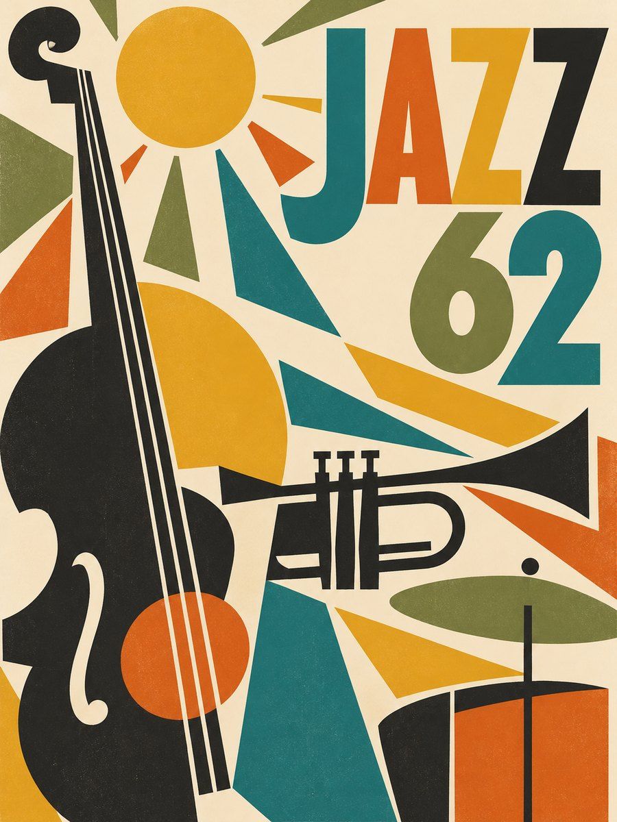
THE FULL SKILL
This is the text the agent reads before it designs.
Essence
Roughly 1945-1970, post-war America and Europe: new materials (plywood, fiberglass, wire, aluminum), optimism and a belief that good design belongs to everyone. Furniture and architecture (Charles and Ray Eames, Eero Saarinen, Arne Jacobsen, Case Study Houses) favored clean lines, honest materials and little ornament. In graphics, Paul Rand brought wit and Modernist order to American advertising and logos, Saul Bass reduced film and brands to bold cut-paper symbols (Man with the Golden Arm 1955, Vertigo 1958, AT&T, United), and Alvin Lustig turned book jackets for New Directions into abstract art. Design with a smile.
Visual vocabulary
- Composition: asymmetric, a big simplified shape or word as the hero, small supporting text, plenty of warm space. Overlapping flat shapes, offset registration, collage feel, playful scale jumps.
- Type: geometric sans (Futura-like), friendly slab or high-contrast serif (Bodoni, Didone) for contrast, occasional hand-cut lettering. Lowercase headlines work. Weights bold for display, regular for text.
Fonts: Jost, League Spartan, DM Serif Display, Fraunces, Josefin Sans, Alfa Slab One, Work Sans (body)
- Color: cream $bg #F3EAD7, charcoal $text #2B2A28, teal $teal #1F7A7A, mustard $mustard #E0A526, burnt orange $accent #D1561E, olive #7A8449, optional walnut #6B4A32. Proportions about 60 cream, 15 charcoal, 25 split among 3 accents.
- Shapes: circles, quarter arcs, boomerang and kidney curves, starbursts, dots, thick lines; flat fills, no outlines unless as a deliberate cut-paper edge.
- Imagery: cut-paper illustration, flat silhouettes, simple objects from the period (chair, atom, lamp, bird), duotone halftone photography.
- Icons: filled geometric glyphs, 2px consistent stroke, rounded caps ok.
In Pego
Variables: $bg, $text, $teal, $mustard, $accent, $olive, radius 0 and 999 only, space 8/16/32/64.
- Landing hero: row on $bg, padding [96, 80]. Left: 72 / weight 700 headline (Jost lowercase or DM Serif Display), 18 support, one $accent button radius 999 height 52. Right: a composition frame (layout none, 560x560) of overlapping ellipses and rectangles in $teal, $mustard, $accent plus one quarter arc (an ellipse clipped by a frame with clip true). One small star or dot field.
- App screen: calm cream surface, cards as flat color-block tiles with radius 0 or full pill, section headers in a serif, charts using the 3 accents as flat bars, big friendly numerals; avoid shadows, separate with color not lines.
- Poster or social: layout none, a bold cut-paper symbol filling 60 percent of the frame, event name in 96 geometric type overlapping the shape (text fill $bg on a dark shape), details in 16 at the bottom, margin 48.
Pitfalls
- Kitsch retro: atomic starbursts and boomerangs everywhere, fake distress, wood-grain textures, "diner" script.
- Mixing too many saturated colors; keep one dominant accent.
- Mustard text on cream, teal on charcoal: check contrast, use dark text on mustard.
- Copying Saul Bass or Rand logos; use the method (reduce to one idea), not the artifacts.
- Accessibility: decorative overlapping text over shapes must still pass 4.5:1; keep real text, not outlined images.
Pair with
landing-page (shape-composition hero), social-media (cut-paper posters), brand-identity (one symbol, a wordmark, a three-color system), slides (big shape plus short line per slide), web-app (friendly onboarding and empty states only; keep core screens calm), mobile-app (flat illustrated headers).