THE FULL SKILL
This is the text the agent reads before it designs.
Essence
Not "less decoration" but "emptiness with intention". Ikko Tanaka (1930-2002), the first MUJI art director, fused Japanese sensibility (negative space, Rinpa-school color fields, woodblock-like flatness) with Bauhaus geometry. Kenya Hara (born 1958, MUJI art director since 2001) argues in Designing Design and White that emptiness is a vessel awaiting the viewer's imagination, and white is the color that holds it. MUJI means "no-brand quality goods": plain kraft paper, clear cellophane, one maroon wordmark, a product that says "this is enough". The Japanese concept of ma is the pause between things that gives them meaning.
Visual vocabulary
- Composition: a single subject, a lot of silence, off-center placement, a few precise alignments. Asymmetric balance rather than symmetry; vertical rhythm of whitespace.
- Type: small, calm, soft contrast. Western text in a neutral gothic; Japanese text in Gothic or Mincho (Mincho for refined, Gothic for modern).
Fonts: Noto Sans JP, Zen Kaku Gothic New, Shippori Mincho, Zen Old Mincho, Work Sans (Latin), Hanken Grotesk
- Color: white and paper tones $bg #F7F5F0, ink $text #222222, mid grey $muted #7A7873, kraft #BFA98A, indigo #2F3E57 or moss #7A8068 as optional natural tone, single seal red $accent #B7282E. Proportions 90 neutral, 8 natural, under 2 accent.
- Shapes: thin lines, circles (enso, sun), square tiles; no radius or very small (2). Hairline rules 1px $rule #D9D5CC.
- Imagery: one clear photograph with air around the object, natural light, textures of paper, wood, linen; or no image.
- Icons: usually none; if needed, single-weight line icons at 1.25px.
In Pego
Variables: $bg, $text, $muted, $rule, $accent, $kraft, radius 2, space 8/16/32/64/128.
- Landing hero: vertical, height 900, padding [128, 120]. A small wordmark top-left (16), the headline at 32-40, weight 400, lineHeight 1.5, 2 short lines, placed at 5 of 12 columns offset right, then 128 of emptiness and one 560-wide photo or a single thin 1px line. One text link "view" in $text, underlined, no filled button. Accent seal (16x16 rectangle, $accent) appears once.
- App screen: list-first, rows 56 high separated by hairlines, label left 14, value right in $muted, no cards, one primary action as a plain bordered rectangle (1px $text, radius 2) or text link; sections separated by 64 gaps.
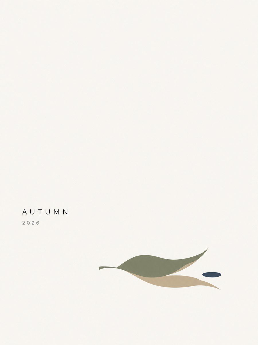
- Poster or social: layout none, $bg field, an off-center circle or photo occupying 30 percent, vertical text column (stacked characters) or a 2-line caption at 14, margin 56. Whitespace dominates; accent seal once.
Pitfalls
- Empty because unfinished: whitespace with no hierarchy or no alignment reads as a bug. Anchor everything to an axis.
- Washed-out text; ma is not low contrast. Keep real text dark.
- Cliches: cherry blossoms, red suns, brush-script "Japanese" fonts, fake kanji for ornament. Use Japanese text only if the content is Japanese and correct.
- Too sparse for conversion UIs; keep the primary action clear while the rest is quiet.
- Accessibility: tiny text at 11-12 and thin weights hurt; Japanese needs larger line height (1.7+) and 14+ size.
Pair with
landing-page (single-product pages), brand-identity (wordmark, kraft palette, one seal), web-app (calm list screens, settings), mobile-app (single-focus screens), slides (one sentence per slide), social-media (quiet product shots).