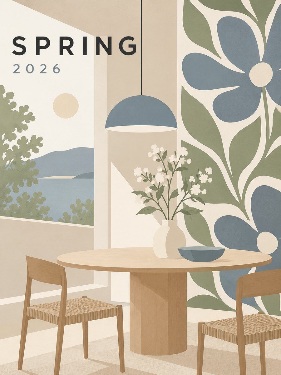
THE FULL SKILL
This is the text the agent reads before it designs.
Essence
Danish, Swedish, Finnish and Norwegian design that blossomed in the 1930s-1960s (Alvar Aalto, Arne Jacobsen, Hans Wegner, Poul Henningsen, Marimekko founded 1951). The idea is democratic functionalism: beautiful, useful, durable things for ordinary homes, made from natural materials, with attention to proportion and daylight. Jacobsen is the model of "total design", from building to teaspoon (SAS Royal Hotel 1956-60, Ant chair 1951-52, Series 7 1955, Egg and Swan 1958). A 1954 American touring exhibition made "Scandinavian Modern" an export. Calm, warm, human.
Visual vocabulary
- Composition: light, airy, calm grids; soft modular cards; generous gutters; strong daylight feel; symmetry is allowed but gentle asymmetry is more typical.
- Type: humanist or gently geometric sans; Danish functionalism prefers clear Grotesk, Finnish print uses bold large display on Marimekko material. Lowercase and sentence case.
Fonts: DM Sans, Figtree, Hanken Grotesk, Outfit, Fraunces (optional warm serif for headlines), Instrument Sans
- Color: white $bg #FAF8F4, oat surface #EFE9DF, pale wood #D8C3A5, charcoal $text #2A2A2A, muted blue-grey #7D8A94, sage #A9B49A. Accent from Marimekko-like boldness: poppy red $accent #D6342C or cobalt #1F4FA3 or sun yellow #F2B632, only as a big pattern or a single control color. Proportions 75 light neutrals, 15 charcoal and mid, 10 accent.
- Shapes: soft rounded rectangles (radius 12-16), circles, simple organic curves from plywood chairs; bold poppy-like flat florals or stripes as the single pattern.
- Imagery: bright natural-light photography of rooms, wood, ceramics, knitwear; flat vector pattern for accents; people look natural.
- Icons: rounded line icons, 1.75px stroke, friendly but plain.
In Pego
Variables: $bg, $surface, $wood, $text, $muted, $accent, radius 12/16/999, space 8/16/24/48/96.
- Landing hero: row, padding [96, 80]. Left: 56 / weight 500 headline, 18 support in $muted, a pill primary button (radius 999, height 52, fill $text label $bg), secondary text link. Right: one 560x520 frame, radius 24, filled with a large flat pattern built from circles and rectangles in $accent on $surface (a poppy as 6 ellipses around a center) or a warm photo.
- Product or app screen: soft cards on $bg with $surface fill, radius 16, padding 24, gaps 16-24, 1px $wood hairline instead of shadow; sidebar in oat; one accent-filled action; friendly empty states with a small pattern. Rounded line icons with labels.
- Poster or social: $surface field, a huge bold pattern frame (60 percent) cropped off one edge, headline 64 in DM Sans medium, short caption, brand dot bottom-left; margin 48.
Pitfalls
- All-white boredom or "beige with a plant": use real hierarchy and one bold moment.
- Overusing pastel with weak contrast; test text on every tint.
- Mixing in Marimekko-style prints at every section: one pattern, one place.
- Cliche hygge props (candles, mugs, knit blankets as filler imagery).
- Cultural care: do not label things Scandinavian when copying a single designer's work; use the principles, not their patterns or protected prints.
- Accessibility: soft grey text on oat fails; keep body 15+ with 4.5:1.
Pair with
landing-page (lifestyle and commerce), marketing-site, mobile-app (soft cards, friendly empty states), web-app (calm productivity), social-media (pattern as hero), brand-identity (soft wordmark plus one pattern), slides (airy sections with a single bold pattern slide).