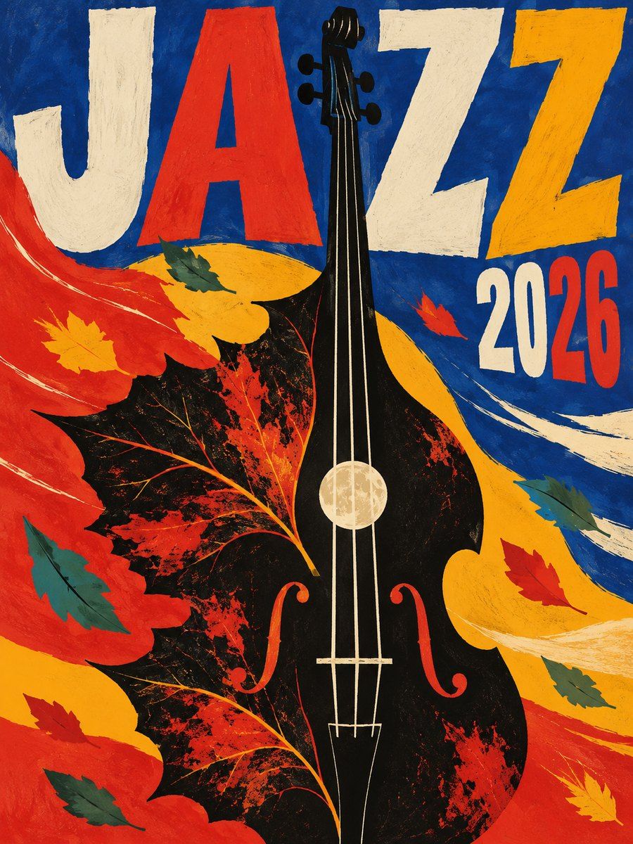
THE FULL SKILL
This is the text the agent reads before it designs.
Essence
From the early 1950s in communist Poland: after Stalin's death in 1956 artists, free from commercial advertising conventions but under censorship, made posters for films, theatre, opera, circus and concerts as conceptual art. Henryk Tomaszewski (teacher at the Warsaw Academy from 1952, Black Narcissus poster 1948), Jan Lenica (Wozzeck 1964), Waldemar Świerzy (painterly, lyrical abstraction with pop and folk influence), Jan Młodożeniec, Roman Cieślewicz (Vertigo 1963) and Franciszek Starowieyski. The poster does not describe the show; it offers a metaphor you decode. Visual economy: one bold image, little text.
Visual vocabulary
- Composition: a single dominant image, often cropped or distorted, with sparse text integrated into it. Asymmetry, scale shocks, and surprising negative space. Image and lettering complete each other.
- Type: hand-lettering, irregular, naive or painterly, sometimes cut-paper letters; minimal words. Closest on Google Fonts below, but treat fonts as a fallback and prefer drawn marks where possible.
Fonts: Bebas Neue (condensed shout), Anton, Fraunces (soft expressive serif), Permanent Marker (hand-marker accent), Alfa Slab One
- Color: vivid and flat or painterly: red #D7261E, deep blue #1D3A8A, saffron #F2A900, black #151515, off-white paper #F1E8D6, teal or green as a counterweight #2E7D6B. Often 3-4 colors only, with grain or brush texture. Proportions 40 dominant color, 30 paper or black, 20 second color, 10 accent.
- Shapes: collage and cut-out shapes, distorted figures, hands, eyes, birds, fish, clocks; torn edges, scribbles, brush strokes, halftone dots.
- Imagery: illustration or painting, never a straight stock photo; symbolic, surreal, humorous or sinister.
- Icons: none; use drawn symbols.
In Pego
Variables: $paper, $ink, $red, $blue, $saffron, $green; radius 0; space 16/32/48.
- Poster (primary use): frame 1080x1528 (B-format ratio), layout none, fill $paper or a strong color field. Build the metaphor from paths, ellipses and rectangles with fills; overlap two or three shapes, rotate one element 8-15 degrees, crop a shape off the edge by clip on the frame. Title in 120-220 condensed or hand-style text overlapping the image, rotated slightly; credits in 18 in one block at the bottom. Add a grain or halftone as many tiny rectangles only if it does not hurt performance; otherwise use flat color changes.
- Landing hero: use only for cultural events, galleries or film festivals: vertical frame 1440x900 with a full-bleed illustrated composition on the right 60 percent, headline overlapping 96-140 condensed, subline 18, and a single high-contrast button; keep the rest of the page much calmer.
- Product or app screen: avoid; use only in an empty or error state, or an event card that borrows one illustration with a solid $paper field for text.
- Social post: 1080x1350, one metaphor, one line of title, handle in 16.
Pitfalls
- Pastiche: pasting rotated "retro" text and a skull. The point is a fresh metaphor, not a look.
- Text lost in the painting; reserve a clean field for readable info.
- Over-detailed illustration or realism; economy and surprise win.
- Politically coded imagery copied without context; use abstractions that fit your own subject.
- Vector-perfect and symmetrical shapes: keep irregularity, overlap and rhythm.
- Accessibility: painterly backgrounds reduce contrast; verify text at 4.5:1 and keep essential info as real text.
Pair with
social-media (event posters and cultural announcements), slides (a poster-like cover and section dividers), brand-identity (event or festival identities), landing-page (festival, exhibition, theatre), mobile-app (empty states and onboarding illustrations only).