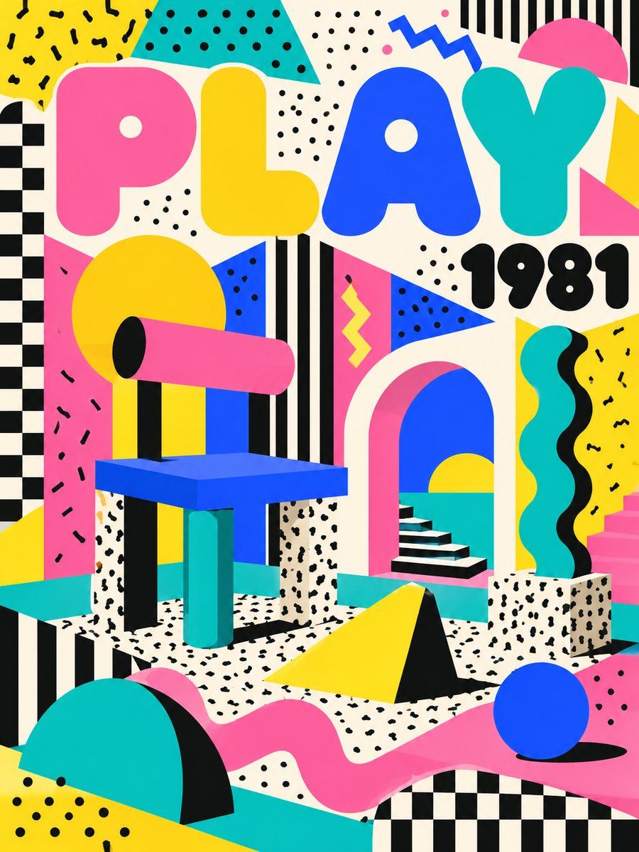
THE FULL SKILL
This is the text the agent reads before it designs.
Essence
Milan, December 1980: Ettore Sottsass gathered young designers (Michele De Lucchi, George Sowden, Martine Bedin, Nathalie Du Pasquier, Matteo Thun and others) and launched Memphis at the 1981 Salone del Mobile. It was a reaction to grey, tasteful, streamlined late modernism. Cheap plastic laminate, terrazzo and printed patterns were treated as luxury, with jokes, totems and clashing color. The Carlton room divider (1981) is the icon. The name came from a Bob Dylan record playing at the first meeting. The group ended by 1987, but its look leaked into TV sets, fashion and 90s graphics. The idea: a surface can be silly and still be seriously designed.
Visual vocabulary
- Composition: modular blocks, stacked and asymmetric, like furniture seen from the front. Objects float on a calm ground with generous gaps. Pattern fills big flat planes; shapes are stacked like a totem.
Fonts: Bowlby One, Archivo Black, Syne, DM Sans
- Typography: heavy geometric display plus a plain body face. Display 72-140, weight 800, tight lineHeight 0.95, black on light ground or white on a saturated block. Syne 700-800 for a quirkier alternative. Body DM Sans 400 at 16-18 in black on cream.
- Color (as variables): memBg #FFF6E5 (50-60 percent), memInk #111111 (lines, text, 10 percent), memPink #FF5FA2, memYellow #FFD21F, memTurquoise #19C2B8, memBlue #2B4BFF (each 5-10 percent), memRed #FF4B3E (accent, under 5 percent). Black-and-white speckle or stripes act as a "neutral" pattern (Sottsass Bacterio squiggle).
- Shapes: triangles, circles, half circles, arches, zigzag, squiggle lines, dot grids, checker, diagonal stripes, terrazzo confetti. Build with rectangles (cornerRadius for half circles), ellipses, and paths with stroke 3-4px black. Use a flat offset shadow (a black duplicate shifted 8px down-right), never a blur.
- Texture substitute: terrazzo = 40-60 tiny rotated rectangles and ellipses in 4 colors on a pale frame; laminate speckle = scattered black dots.
Pego recipes
- Landing hero: frame 1440 x 760, layout none, fill $memBg. Left column text frame (vertical, x 80, y 160, width 600): headline 112 Bowlby One black, support 20 DM Sans, one button (fill $memInk, white text, 56 high, radius 0) with a $memYellow offset block behind. Right: a totem of 5 shapes (yellow circle 220, pink triangle path, turquoise half circle, blue bar 40 x 260 rotated 12, black squiggle path) with children overlapping by 20-40px. A zigzag band 24px high above the footer divides sections.
- Poster or social post (1080 x 1350): fill one saturated block ($memPink) on the top half, $memBg below. Giant word (200+) broken over 2-3 lines and rotated -8, stacked shapes behind it, details in DM Sans 28 on the plain half only.
- Event page: header band in a pattern tile (dot grid) with the date in a yellow circle. Program as a vertical list of rows on cream, each row a card with a black 3px stroke and a colored number square. Ticket CTA as one yellow block with a black offset shadow. Component: ticket-row, shape-badge.
Pitfalls
- Costume pastiche: pink and teal triangles scattered everywhere with no structure. Choose 3-4 shapes and repeat them; keep alignment on a clear grid.
- Pattern behind body text, or red text on pink. Keep running text on $memBg or white.
- Neon gradients and glow (that is vaporwave, not Memphis): Memphis is flat, opaque, outlined.
- Too many type styles. One heavy display, one body.
- Corporate Memphis (blobby people with tiny heads) is a different, empty cousin: do not draw it.
- Accessibility: yellow text needs a black ground; check pairs, keep touch targets 44px, never encode meaning by color only.
Pair with
Landing-page, social-media and brand-identity skills for structure; quiet-ink or swiss-grid tokens for the calm body layer. For a toned-down version, keep the palette to 3 colors plus black.